02 Old Mutual Malawi · Asset management
Redesigning the Old Mutual Malawi app experience
Old Mutual Malawi's apps worked, but they felt cluttered and impersonal and no longer met the Group's standards. I led a six-week redesign that had to serve two very different people: first-time smartphone users managing their savings, and claims approvers working through a queue.
- Role
- Lead designer, freelance
- Timeline
- Q4 2025 (6 weeks)
- Partner
- Kinga Global with Old Mutual Malawi
- Platform
- iOS and Android
The challenge
Customers struggled to manage their finances in the app because it felt cluttered, impersonal and hard to navigate.
Old Mutual Malawi, part of the Old Mutual Group, is the largest life assurance company in Malawi. As digital-first rivals raised the bar, its apps offered only basic functionality and weren't driving engagement, adoption or cross-selling.
Competitive pressure
Digital-first rivals exposed the limits of the existing apps.
Fragmented brand
Inconsistent experiences weakened Old Mutual's image as a trusted partner.
Cluttered and impersonal
Weak hierarchy and unclear actions made managing money frustrating.
Unintuitive flows
People got lost, abandoned tasks and engaged less.
How might we turn a complex financial tool into a simple, reassuring guide for users of every level of digital literacy?
What we learned
Overwhelmed, not empowered
Financial jargon and clutter created anxiety, especially at stressful moments.
Digital literacy varied widely
From confident users to first-time smartphone owners, one-size-fits-all navigation failed many.
Inconsistency undermined trust
Fragmented experiences across app and web eroded confidence.
Efficiency was a hidden need
People wanted to finish tasks like claims and documents without deep navigation or calling support.
Designing for two people
Leah, a cautious saver who feels overwhelmed by dense financial data, wanted quick check-ins on her portfolio, a warm interface in clear local language, and bite-sized tips to build confidence. Kondwani, a claims approver slowed by manual processes and scattered data, needed a central dashboard, real-time status tracking and timely notifications.
Approach
- Research user needs, business goals and the competitive landscape.
- Define personas, journeys and wireframes to set structure and hierarchy before visual styling.
- Design high-fidelity screens that balance local context with global standards, extending the Old Mutual Design System with mobile-specific components using Atomic Design on a 4-column, 4px grid.
- Test iteratively with users for clarity and confidence.
The redesign
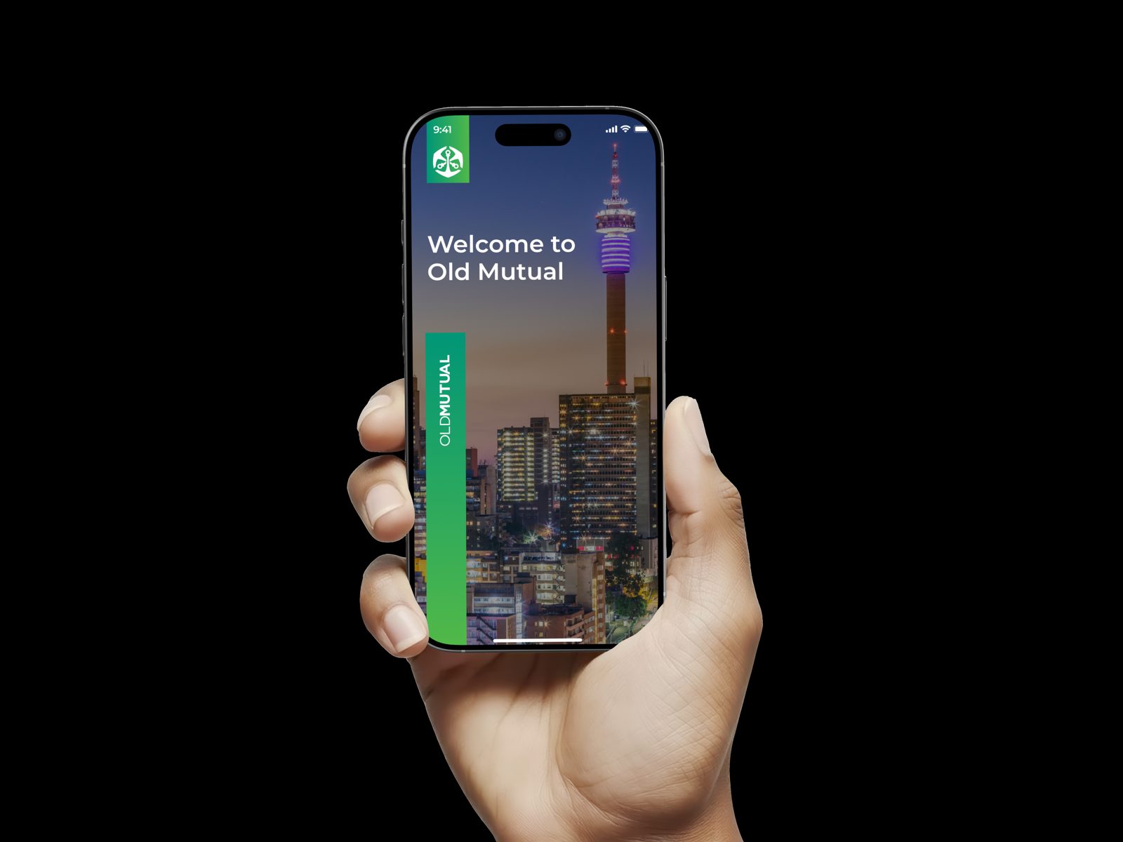
Onboarding that builds trust from the first tap
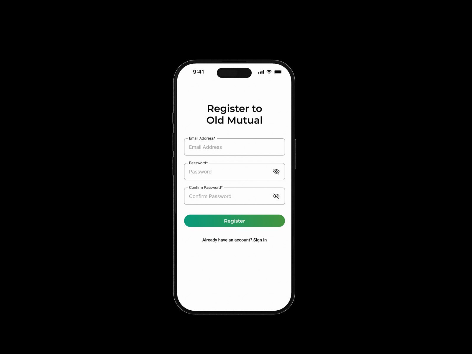
A branded introduction, quick access to login and sign-up, and secure email and password verification with OTP that balances security with ease of use.
A dashboard built around three needs
Knowing where you stand, acting quickly, and discovering relevant opportunities: a grand balance across accounts, individual account totals, an asset allocation chart, and quick actions to file claims, get documents or update details.
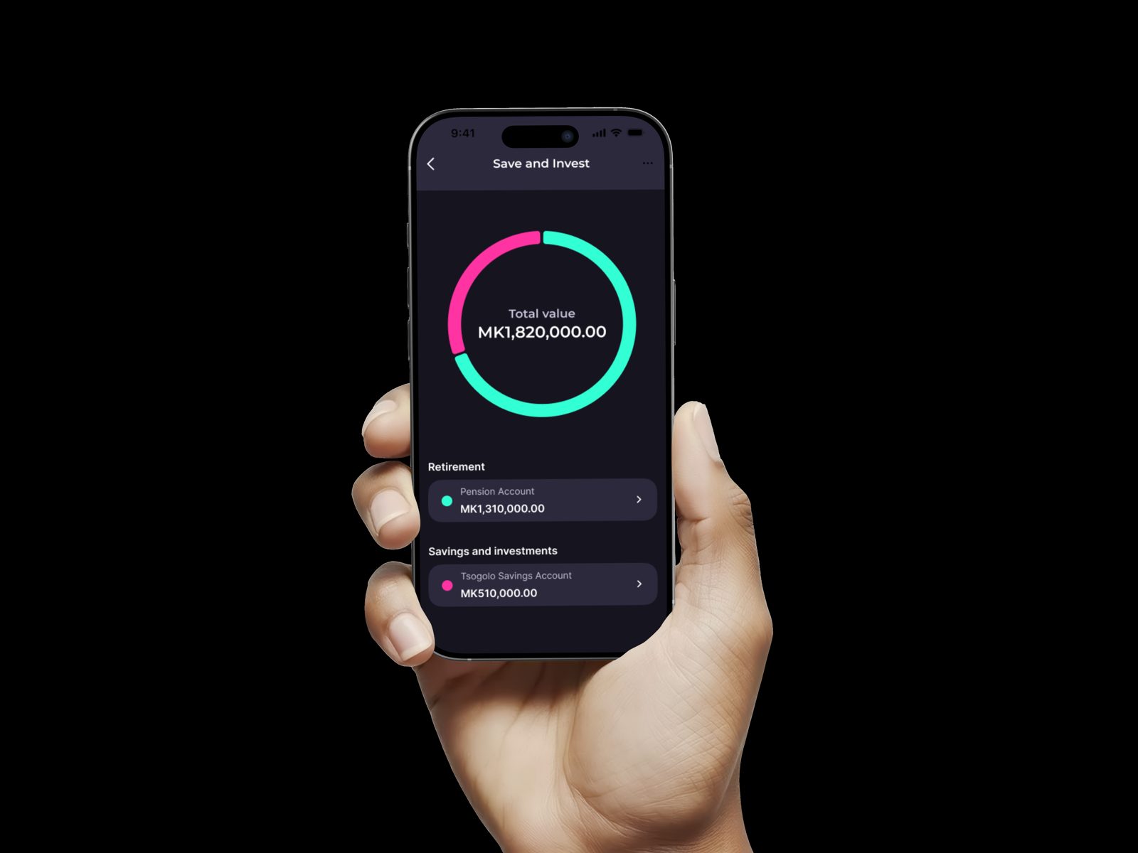
Portfolios that mirror how people think about money
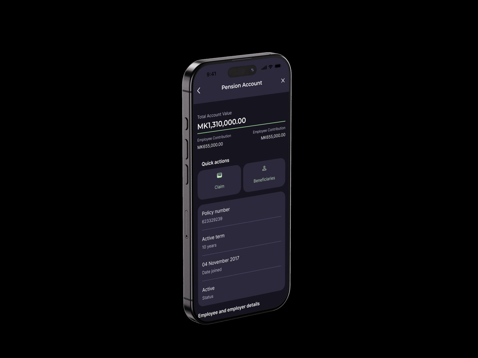
Retirement and savings grouped clearly, with the three most important figures up front (total value, employer and employee contributions) and account-level quick actions.
Self-service and a purpose-built approver view
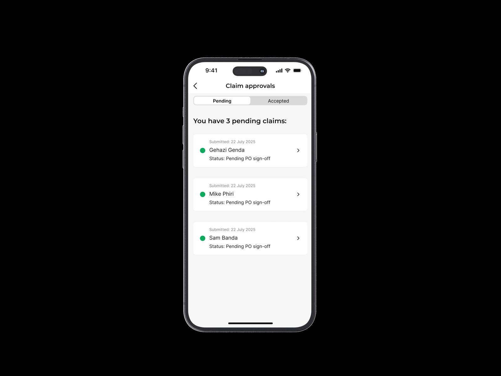
Profile, documents, payment history and application status in one place, so people don't need to call support. For claims approvers, a dedicated interface centralises the claims queue, beneficiary changes and claim tracking, with clear approve or decline actions.
Key decisions and trade-offs
Extend the system, don't replace it
Rather than start from scratch, we extended the Old Mutual Design System with mobile-specific components. It kept the app consistent with the Group and made six weeks realistic.
Structure before style
Personas, journeys and wireframes set the hierarchy before any visual styling, so the clutter problem was solved structurally, not cosmetically.
Scope to what matters most
With six weeks, we prioritised the key features, ran agile sprints with weekly milestones, and validated early with rapid prototypes instead of polishing everything.
A separate view for approvers
Claims approvers have a different job from customers, so they got a purpose-built interface rather than extra screens bolted onto the customer app.
Leading a distributed team
The work was delivered remotely with Kinga Global across different working styles. We made that work with shared tools, centralised documentation, regular check-ins and feedback, and clear roles and expectations.
Outcome
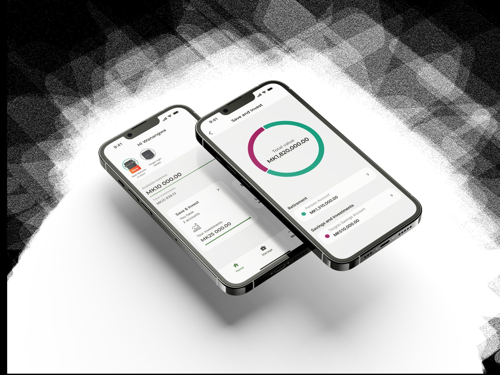
- The app moved from "cluttered and clinical" to a calm, supportive experience.
- Plain, human language in place of financial jargon helped people make better decisions.
- Real-time data in a modern, consistent design reinforced Old Mutual's reputation.
What I took away
A tight timeline and an existing design system forced disciplined prioritisation, and proved that constraints can sharpen focus. Clear communication and cultural awareness turned distributed teamwork into a strength.